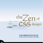
I recently finished The Zen of CSS Design. The book has a good display of creative website designs, and it’s good for providing inspiration. It organizes the content in an interesting way, where each chapter focuses on a single aspect of desgn: ie, layout, imagery, typography, etc. Within each chapter, individual designs are dissected and evaluated as they apply to these design principles.
Unfortunately, I found much of the text to be cheesy and repetitive, not unlike what you would stick in a history paper to reach the word count your teacher asked for. The author is at times ambiguous, and at other times attempts to wax poetic.
It suffers from an identity crisis that many web books do: It moves too fast for the beginner, and re-hashes the basics too much for the experienced. Myself being in the latter camp, and my eyes start to glaze over when I read how to use a “background-image” or “border” property.
Also, with many CSS books, it fails to acknowledge when compromises are necessary. There are times when it’s just plain better to use JavaScript or tables. As a working web developer with deadlines and budgets, you don’t have the luxury (burden?) of creating 10 lines of CSS and 3 divs just to avoid using a little 2 cell table.
Overall, I’m glad to have the book, but mostly for the eye candy rather than what it has to say.

@Peter – Thanks for providing such an honest review. I’m so tired of book reviews that don’t tell the whole story. I especially like the bit about word-stuffing for the sake of word count.
There are plenty of web books I haven’t read – including this one – but I’d agree that many are too fast for the beginner yet not enough for the experienced.
As for the little 2 cell table… if it really is tabular data, then it should be a table, otherwise I might use a Definition List (if it’s semantically appropriate) or some combo of divs, spans, strongs, and/or ems.
Being that this book was published in February 2005, the bulk of the writing was presumably done in 2004 when the web standards (and the “don’t use tables for layout”) movement was still shouting like crazy to win over few converts. So it doesn’t surprise me that they’d be more idealists and gloss over any compromises.